CASE STUDY
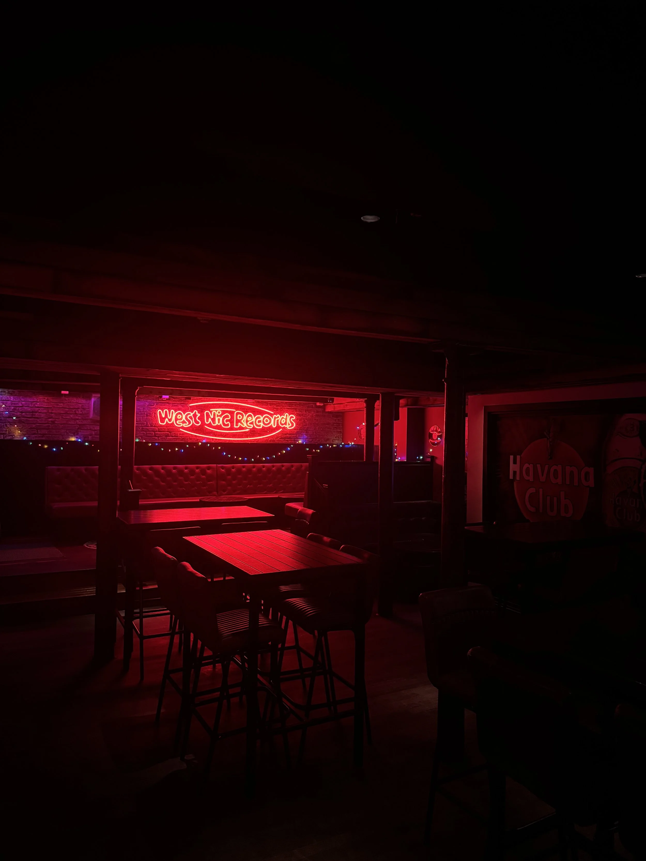
WEST NIC RECORDS
Turning an outdated student bar into a refurbished, re-branded live music and cocktail venue.
THE BRIEF:
To rebrand, refurb and modernise an out of date bar in the heart of Edinburghs Old Town.
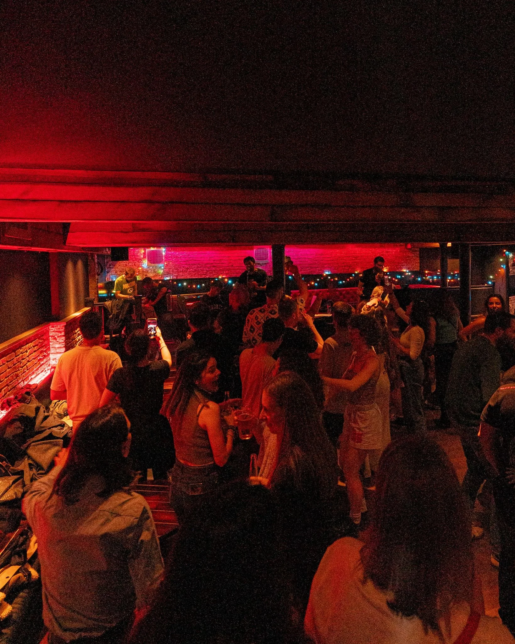
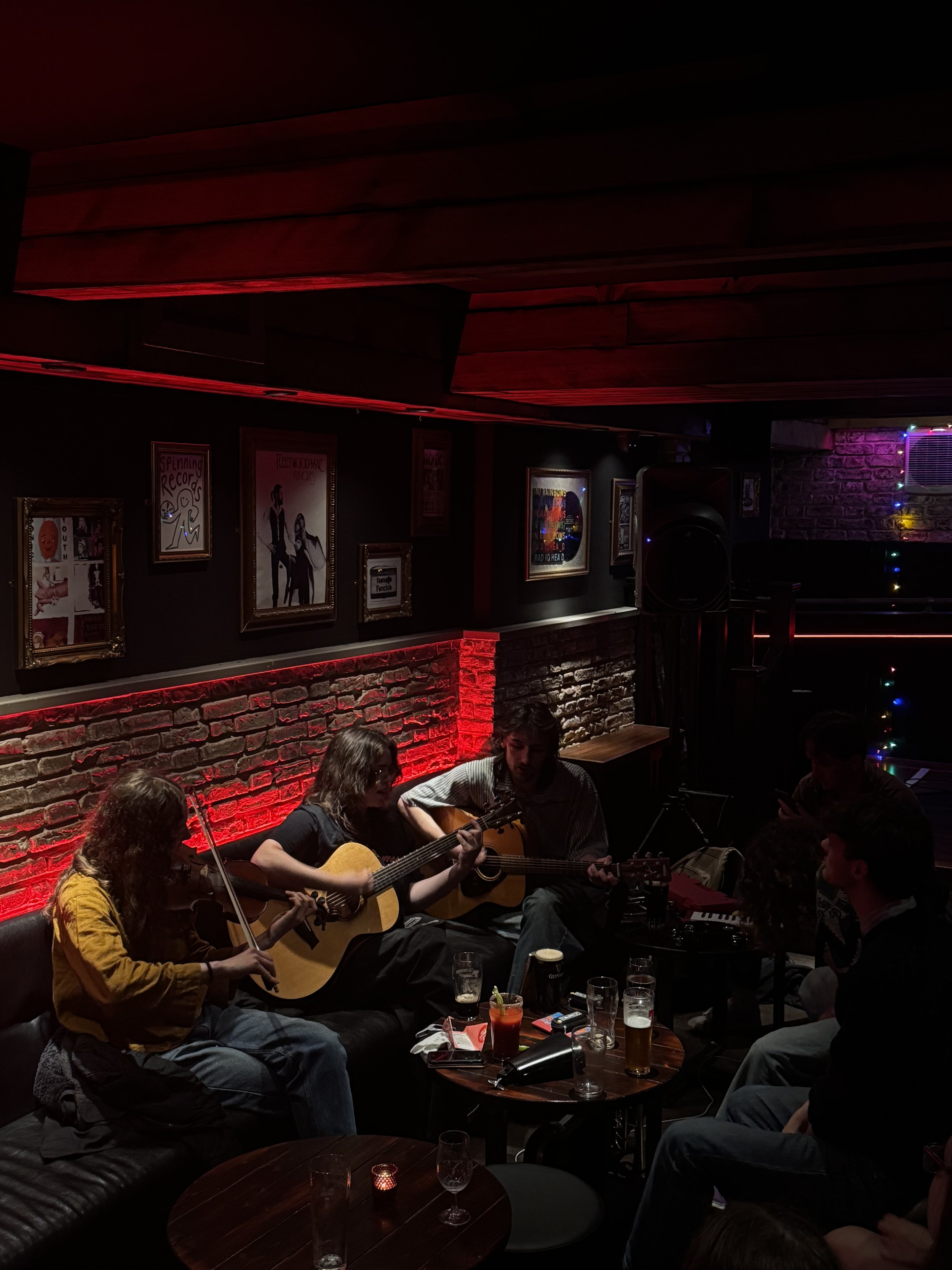
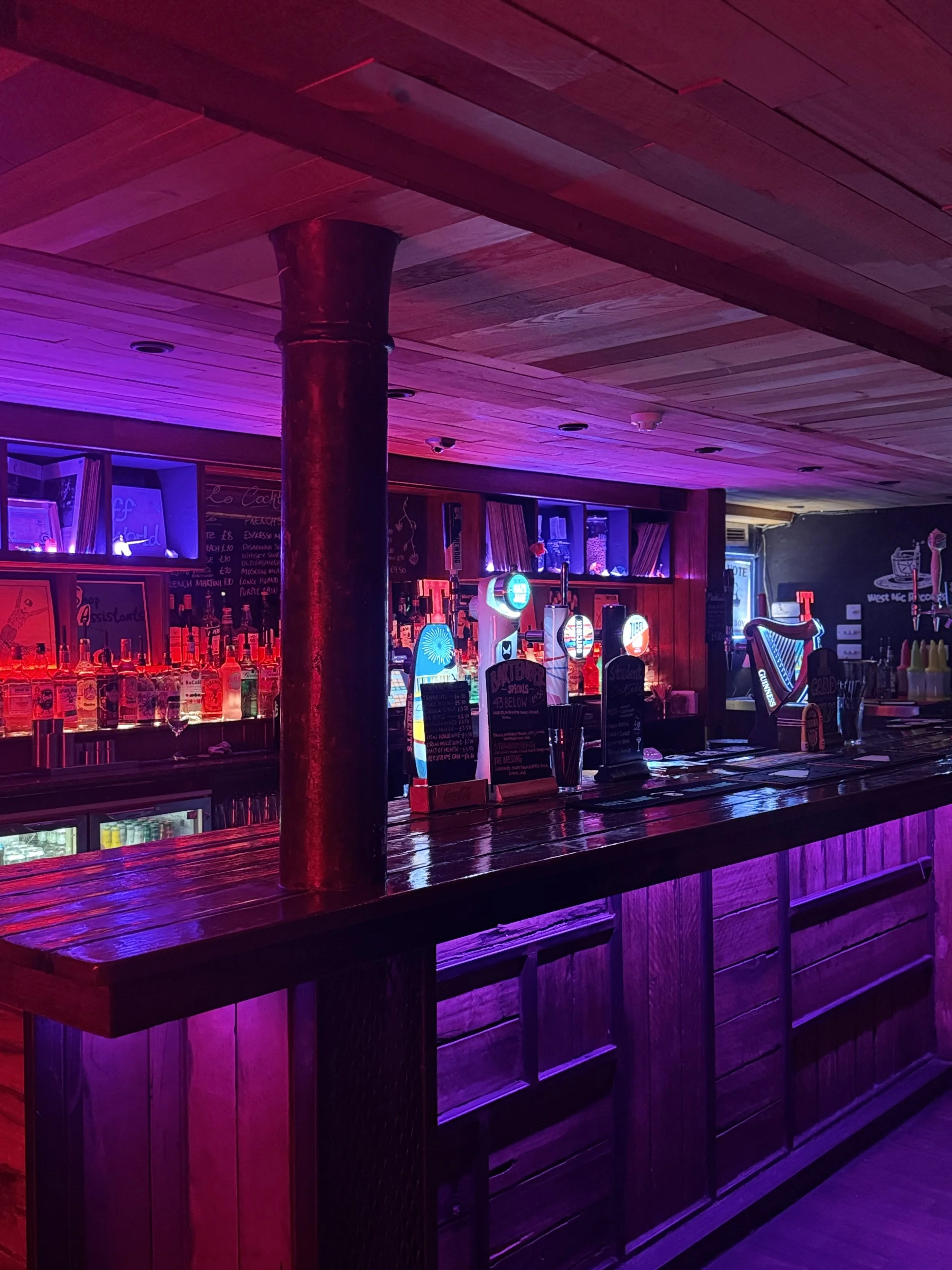
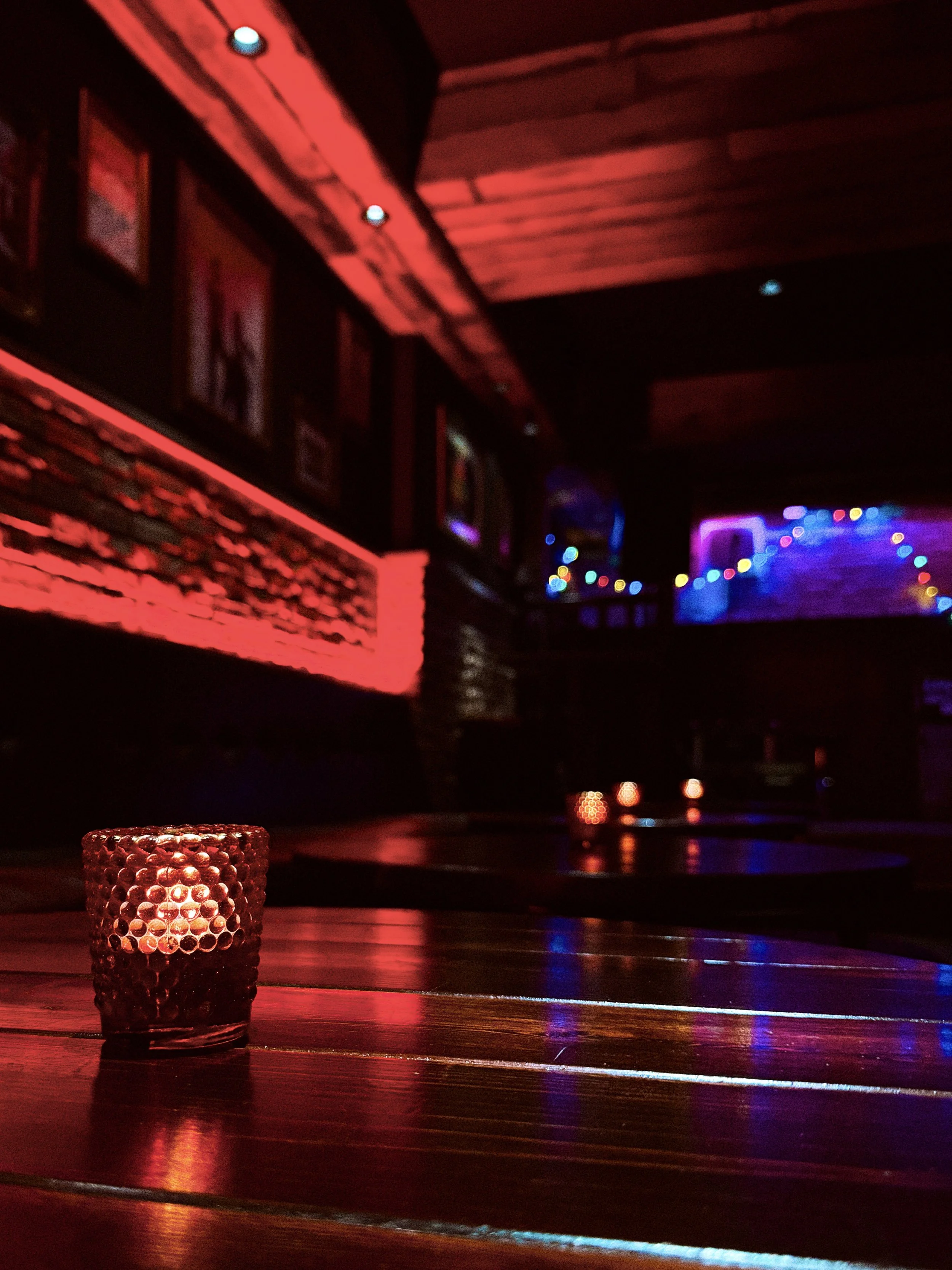
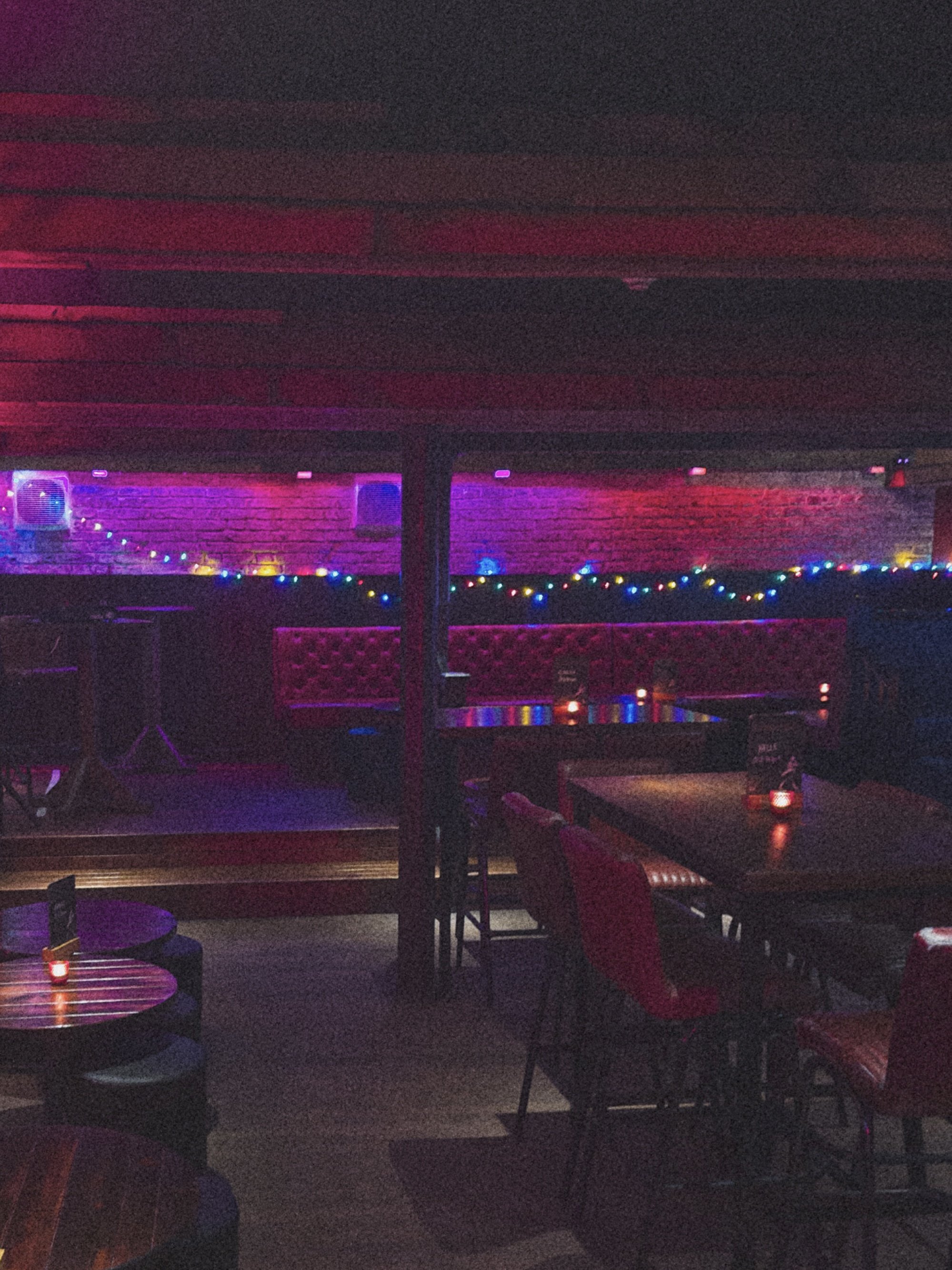
32Below was a fairly steady student bar, but over the years had been declining in regular bar service and had a branding and interior that was extremely out of date. The idea was to turn it into a live music venue/dive bar and lean into the basement vibe, but make it cosier, warmer, darker and funkier. I needed to figure out a way to turn the old, sterile branding into something that accurately reflected the atmosphere we were trying to achieve.
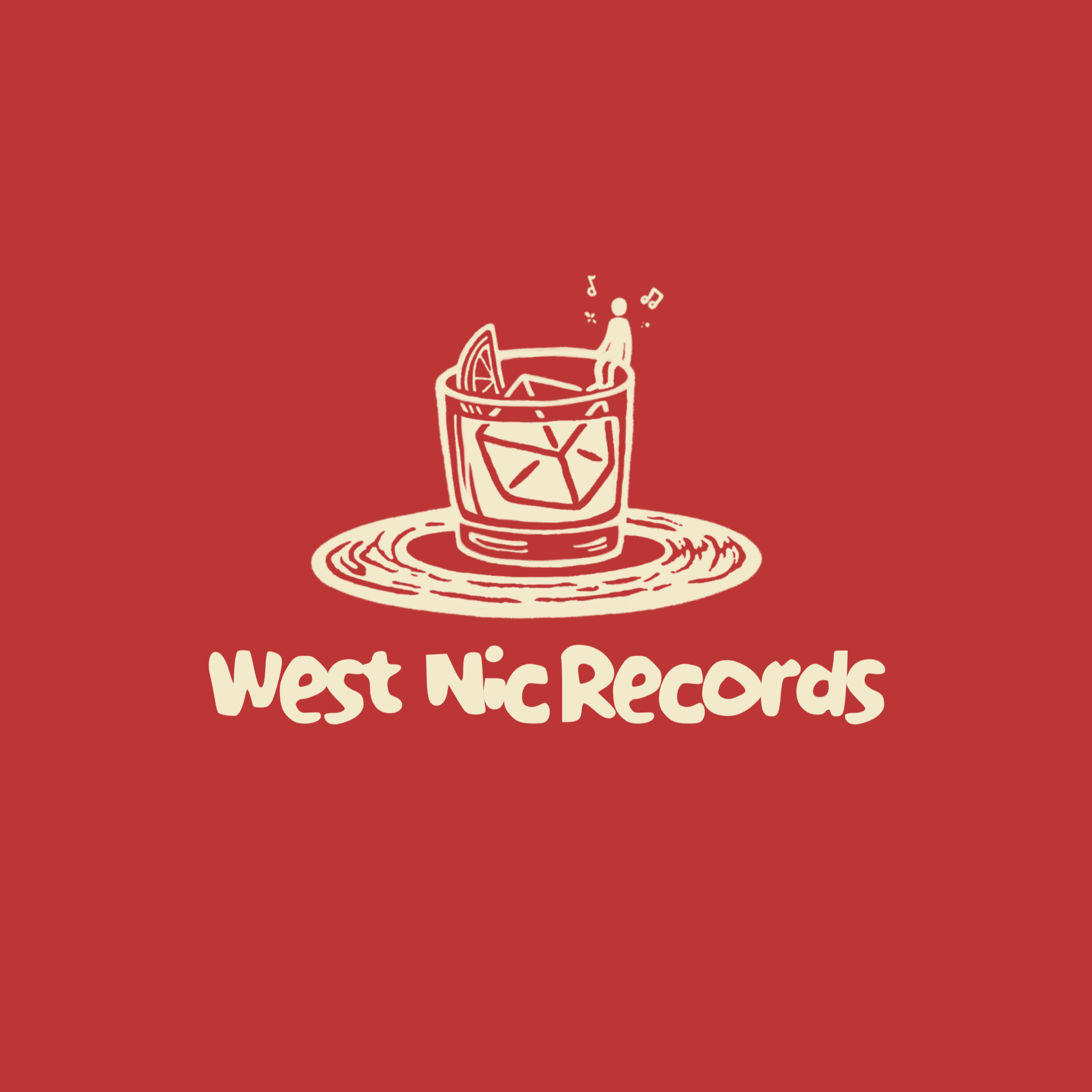
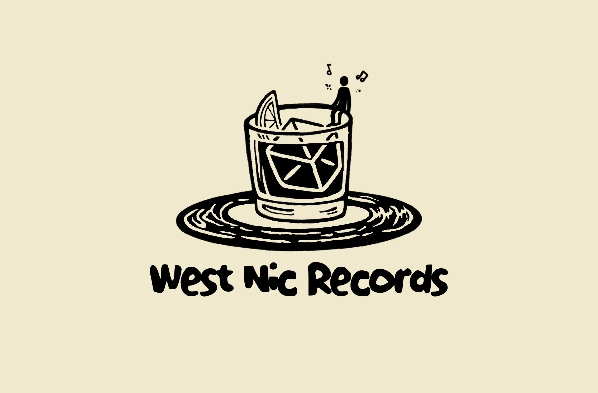
As you can see from the old 32Below logo, there isn’t much character to it nor does it really tell you anything about the venue. It is a plain block text wordmark with no character.
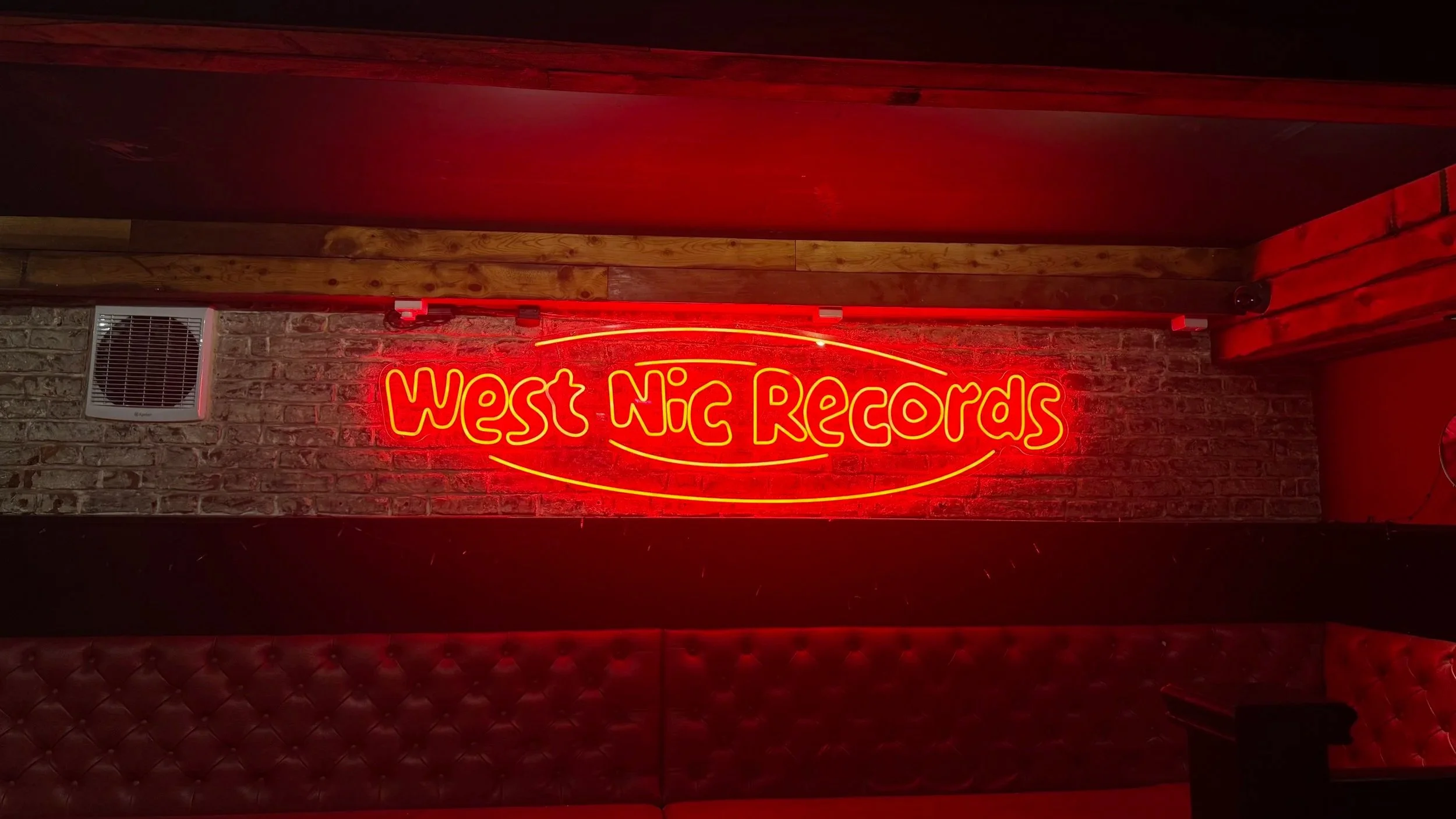
CREATING THE BRAND
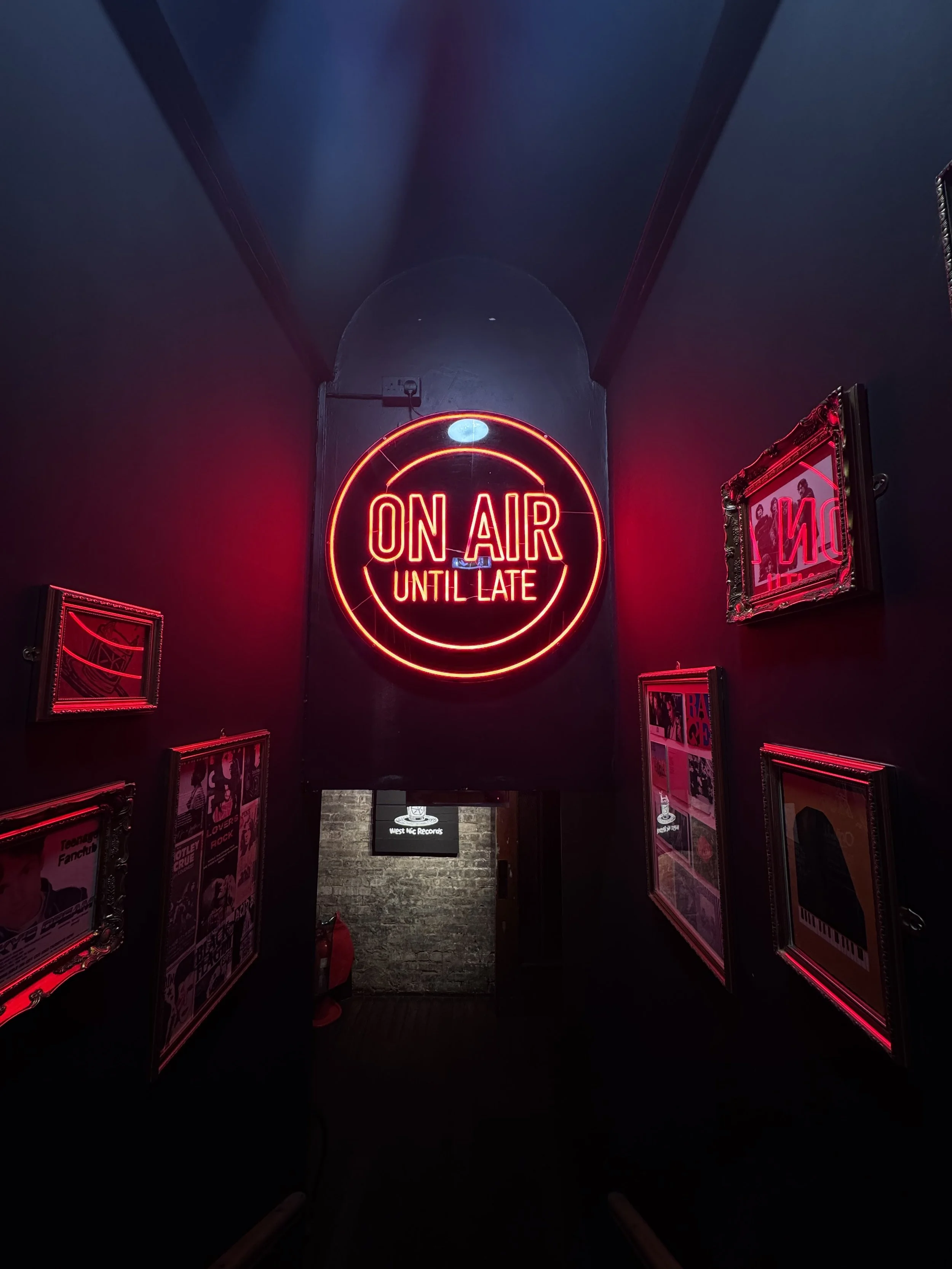
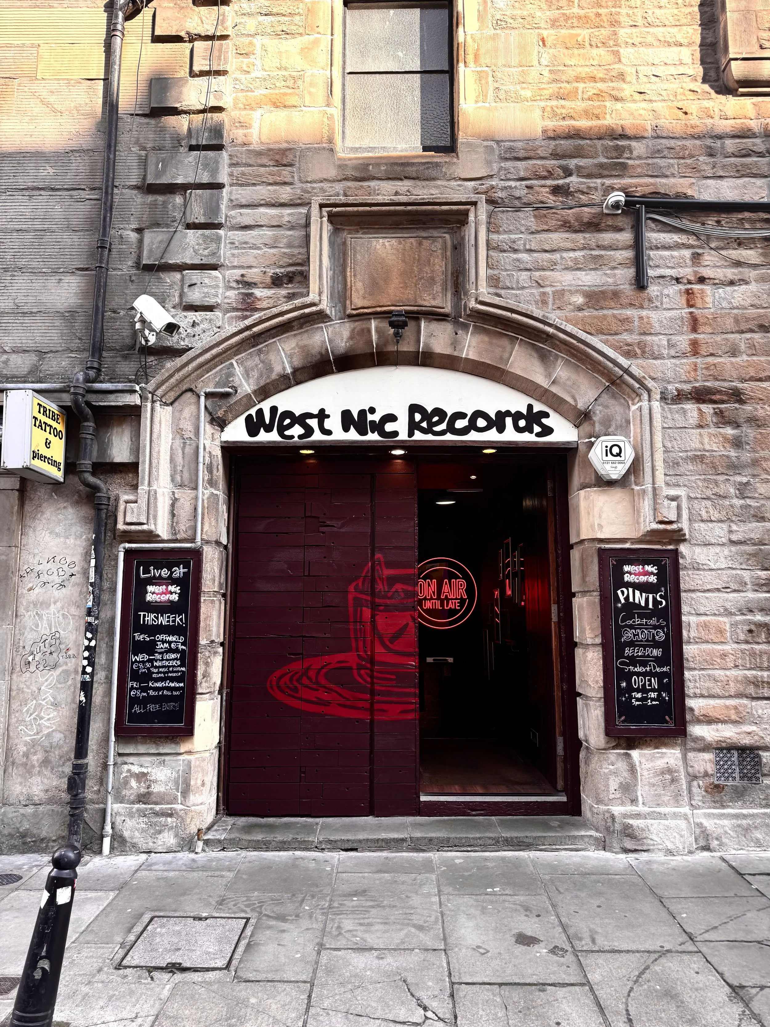
I built the logo combining musical elements and drinks imagery to get the aims of the bar across from the outside. Being a basement bar with no windows, I had to ensure the logo and imagery gave enough information from outside to accurately reflect the intentions of the brand, which in a nutshell, was all about live music and good drinks.
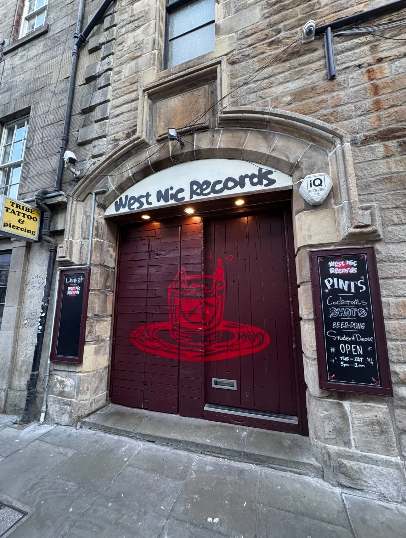
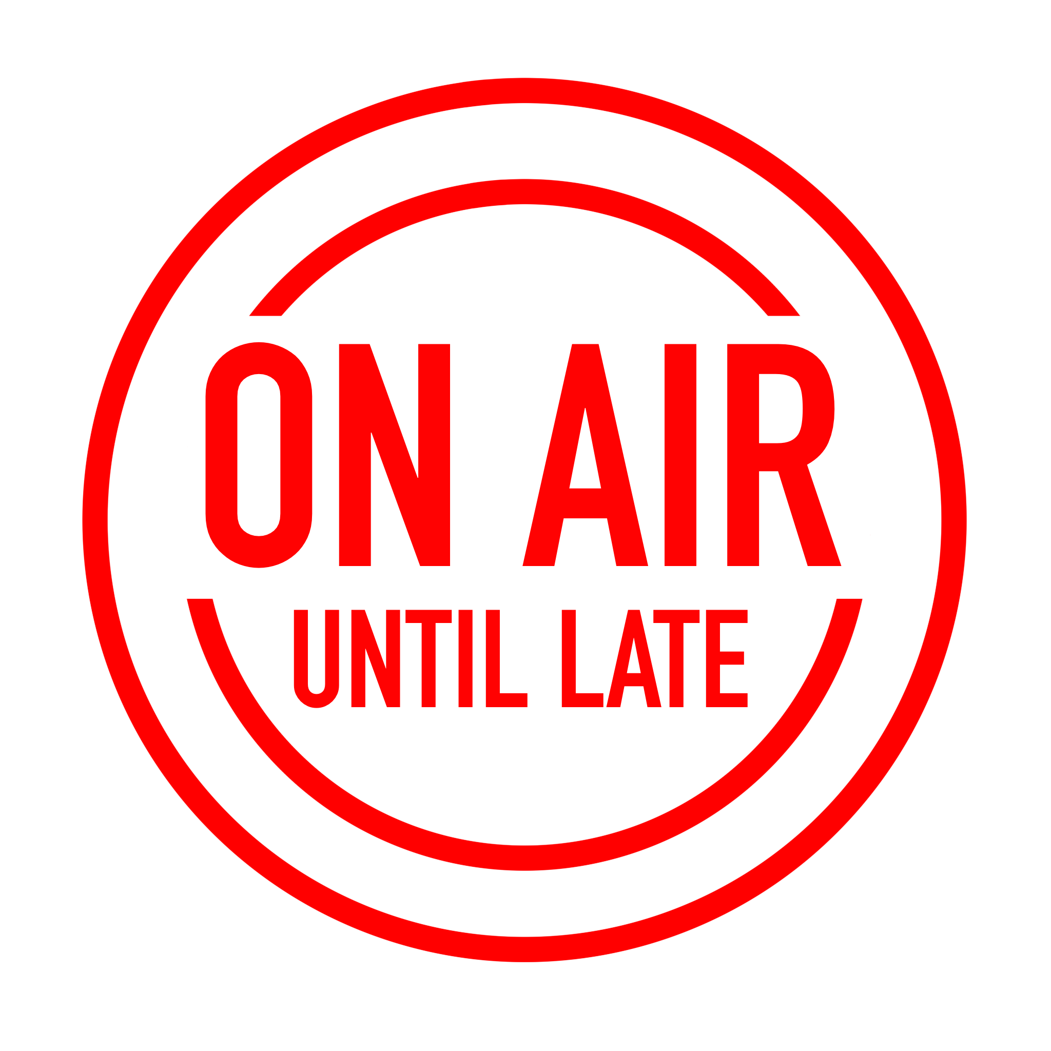
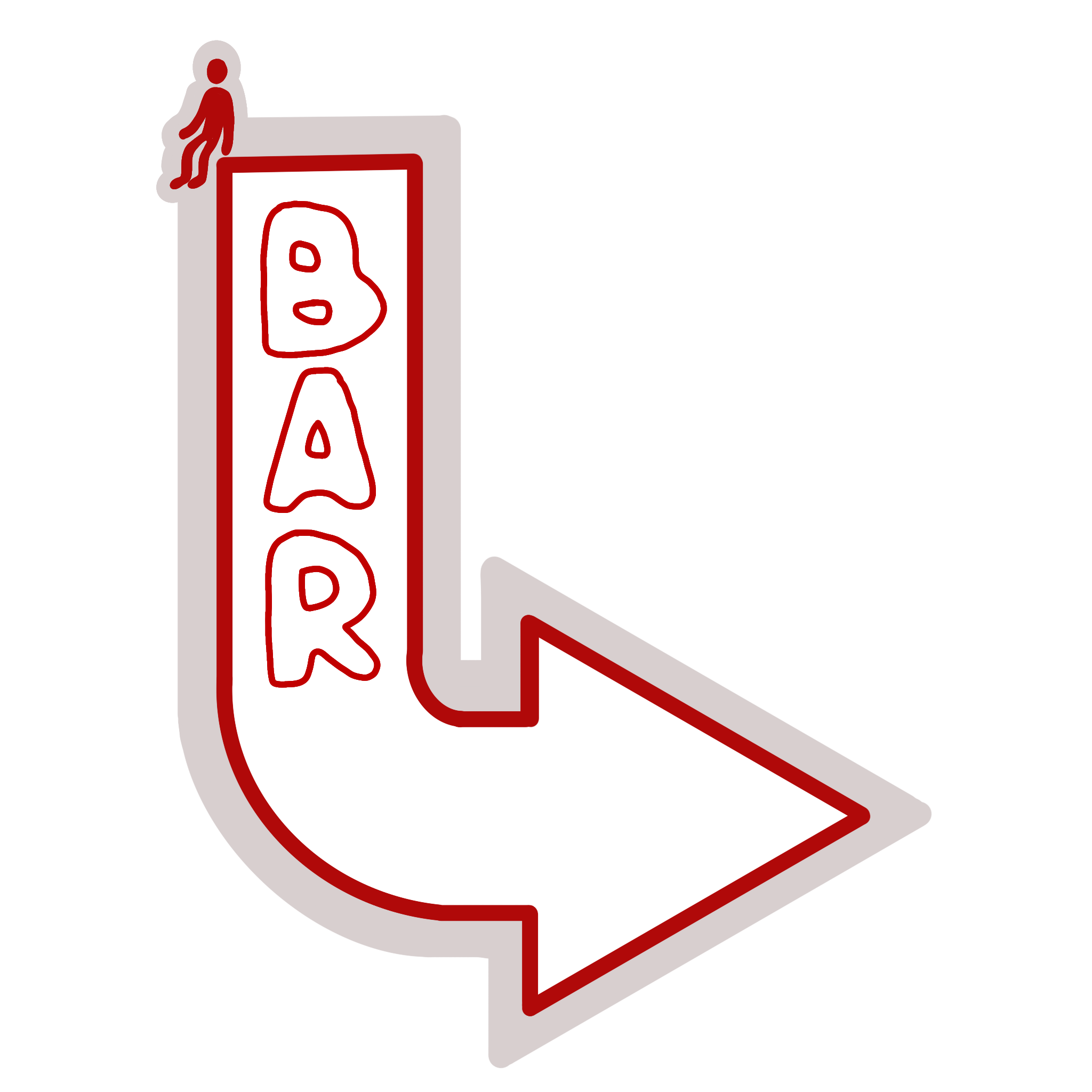
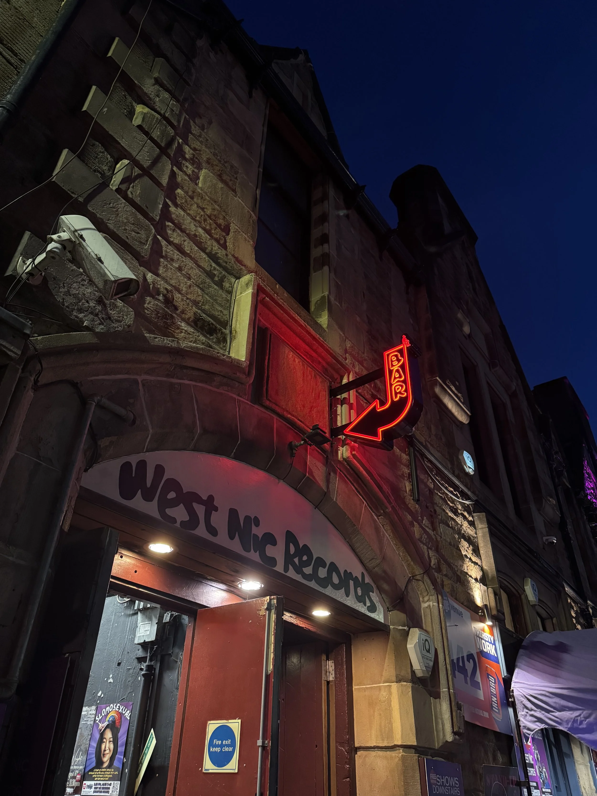
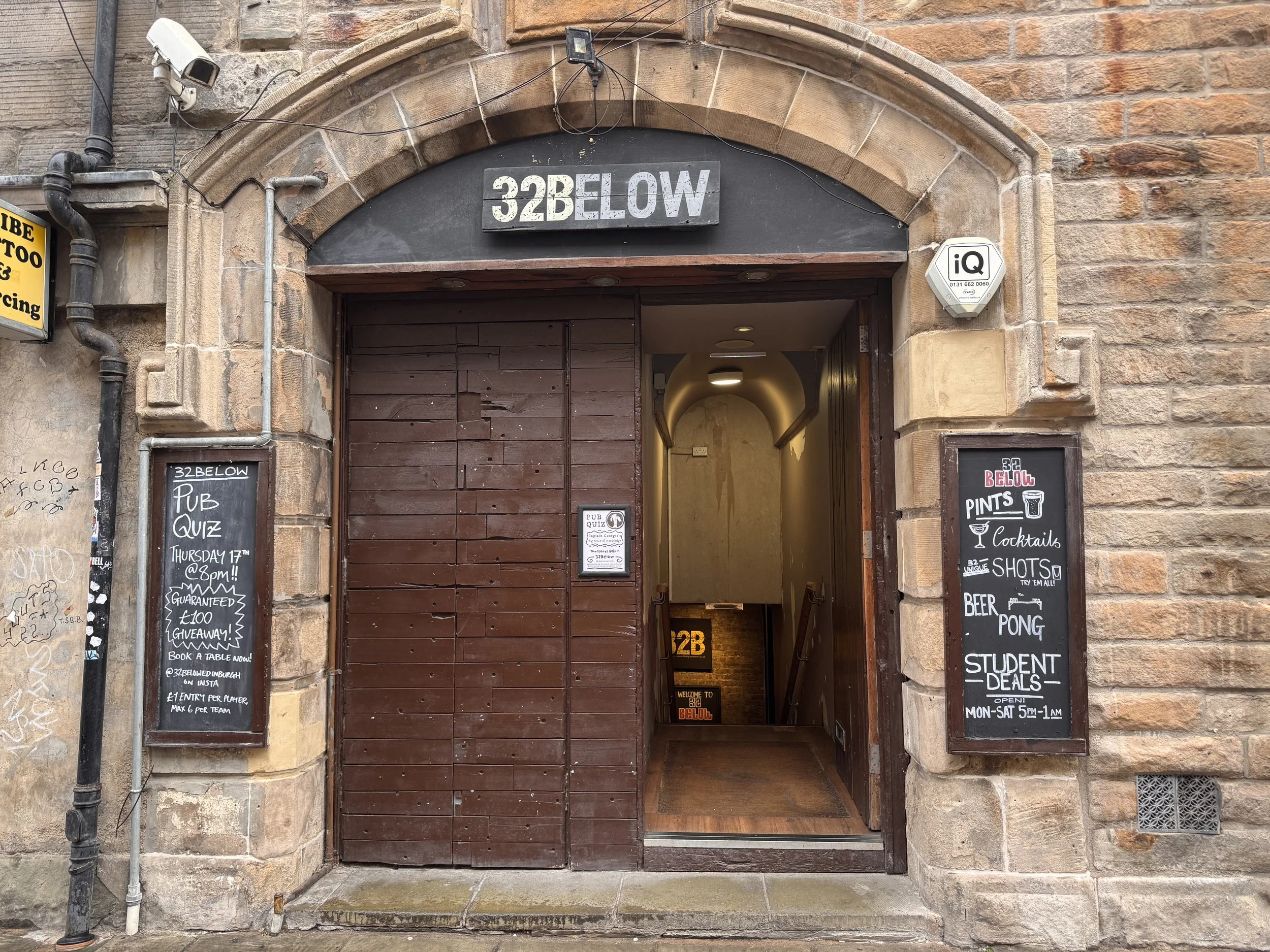
APPLYING THE BRAND TO THE EXTERIOR
DESIGNING ON-BRAND SIGNAGE

ART DIRECTION - Brand Mural
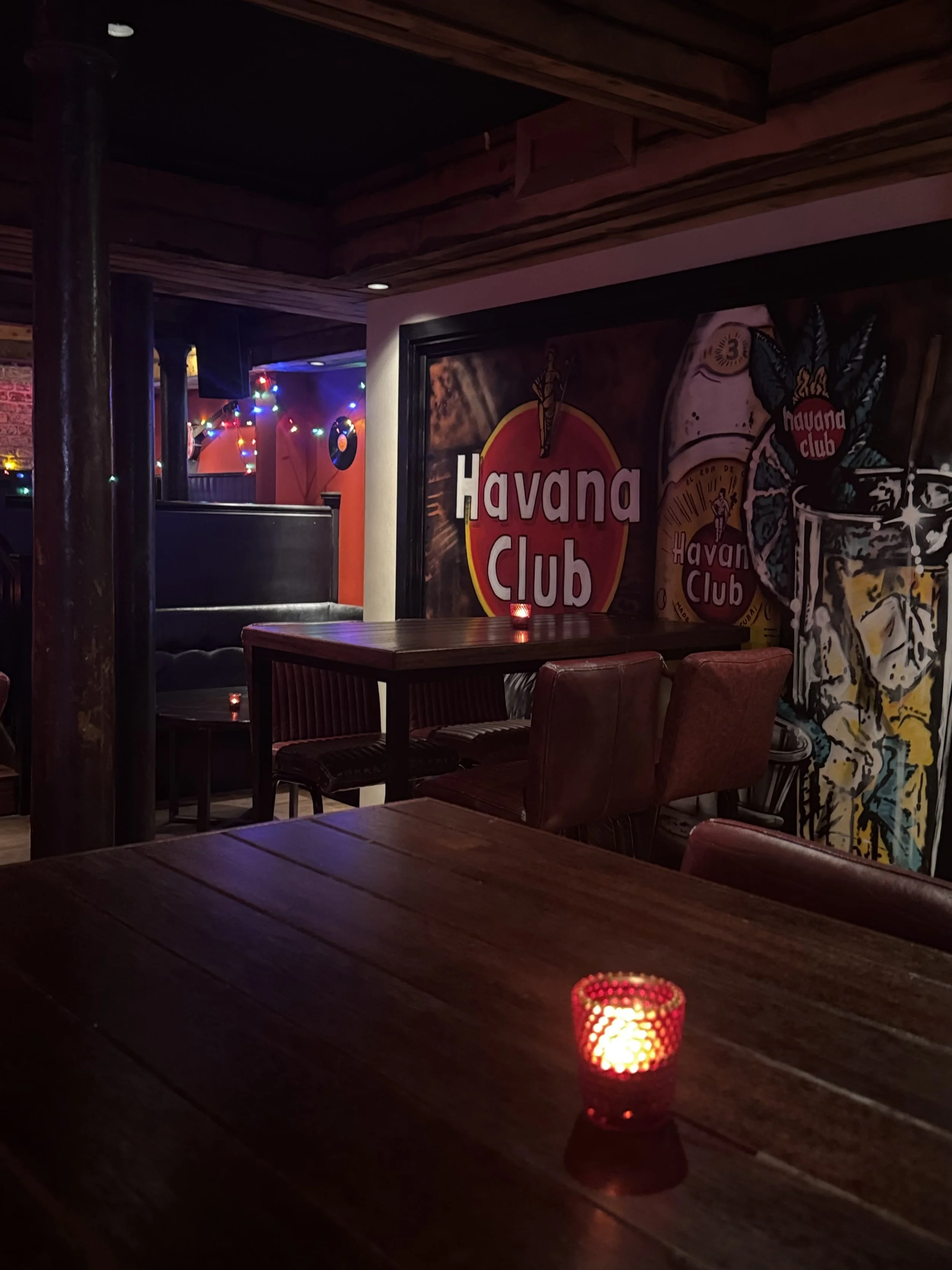
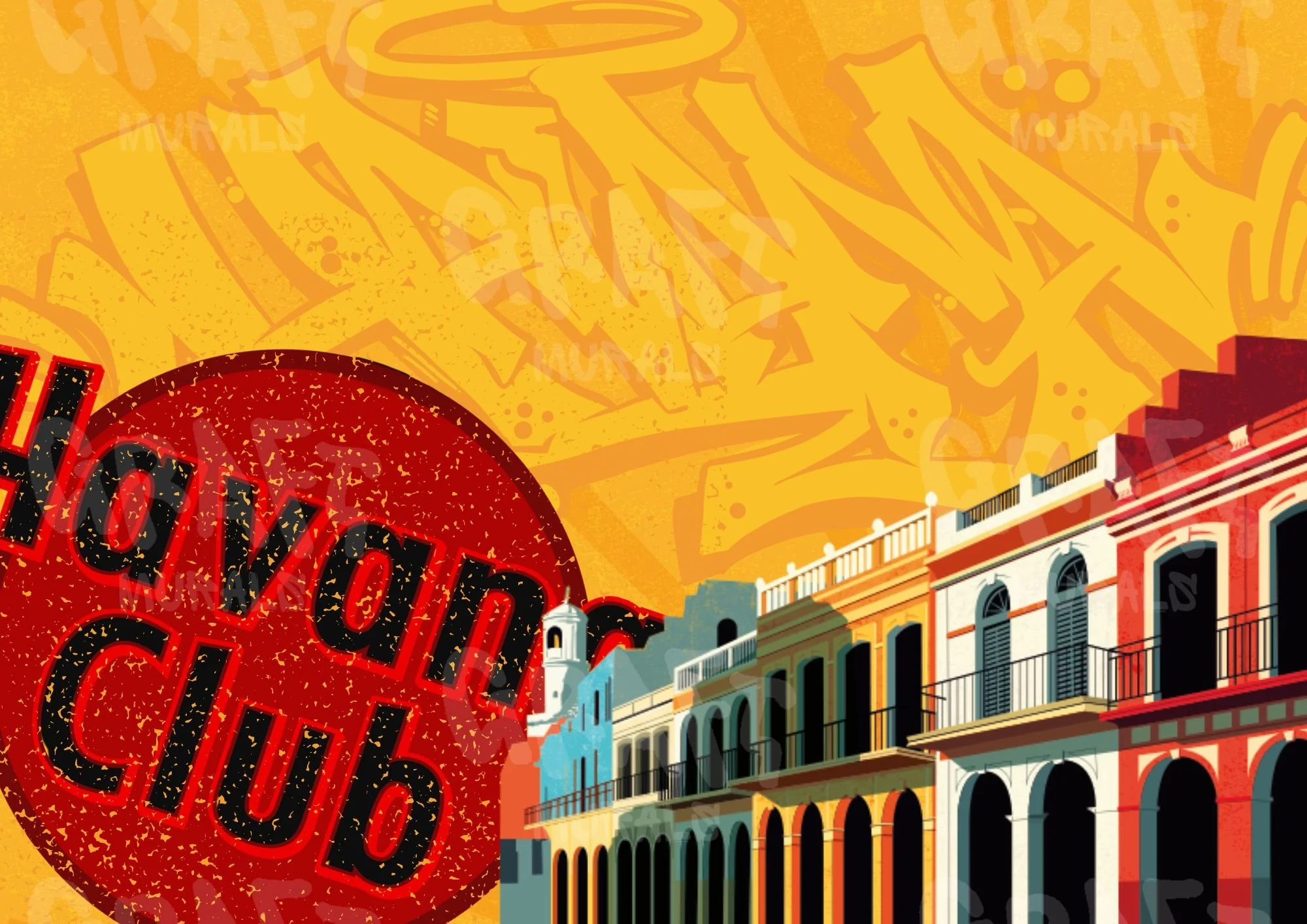
We had space for a large mural to include imagery for a rum brand who were paying for the advertisement space.
The brand sent their guidelines over to a local mural company to design the mural, however upon seeing the design I realised they hadn’t considered utilising our brand guidelines along with their own, so I decided to steer it into a direction with both of our brands goals in mind.
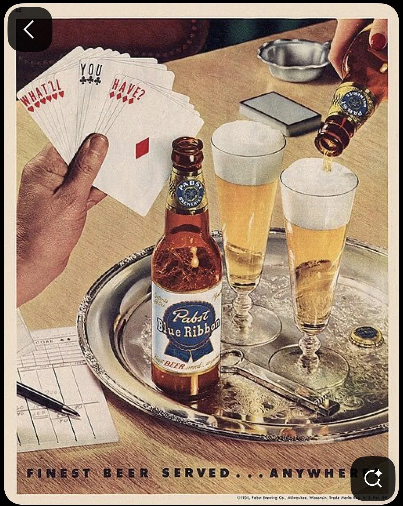
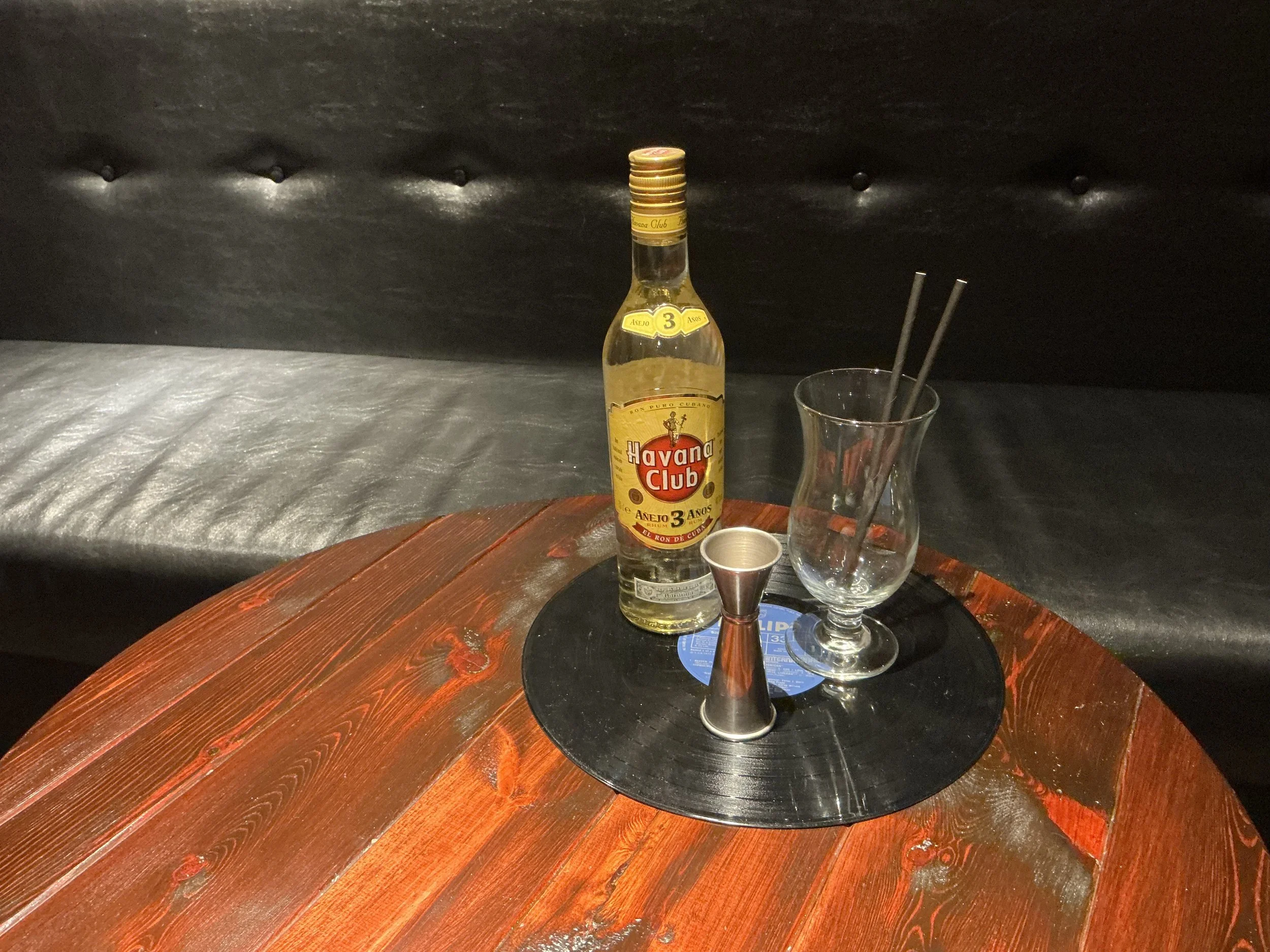
I wanted the mural to feel like it belonged in the space, using our imagery, colours and style, as well as effectively communicating the brand product. I sent them a photograph of a physical mockup, complete with our signature record with drinks placed on top to mimic the logo, with some inspiration from vintage alcohol adverts, to steer them in the right direction.
Original mural ideas:
Too flashy, doesn’t feel as intentionally led.
Graffiti style didn’t fit with brand style, too distracting.
Maximalist style strayed too much from minimalist logo.
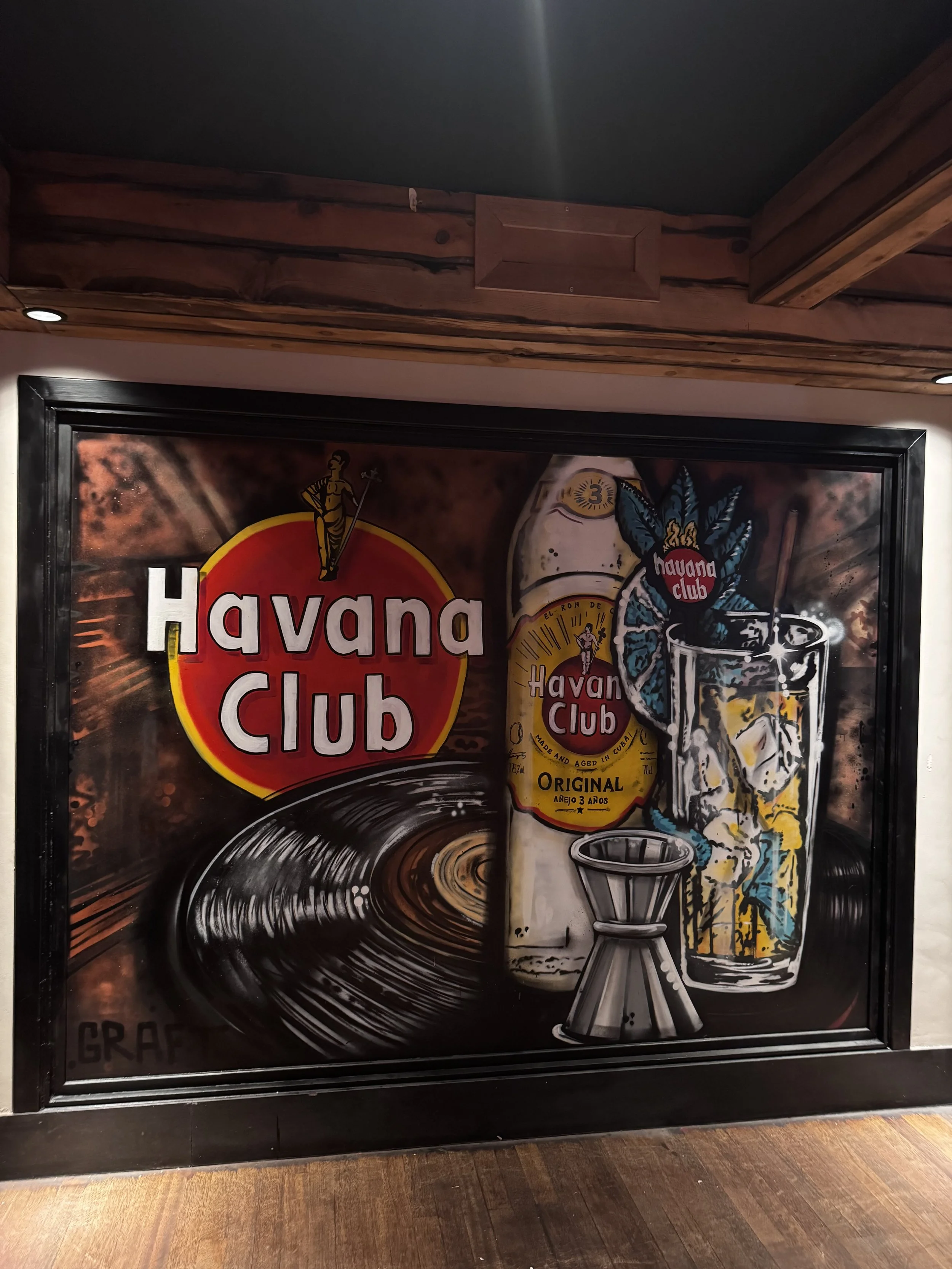
THE FINAL MURAL
FURTHER MURAL ART DIRECTION
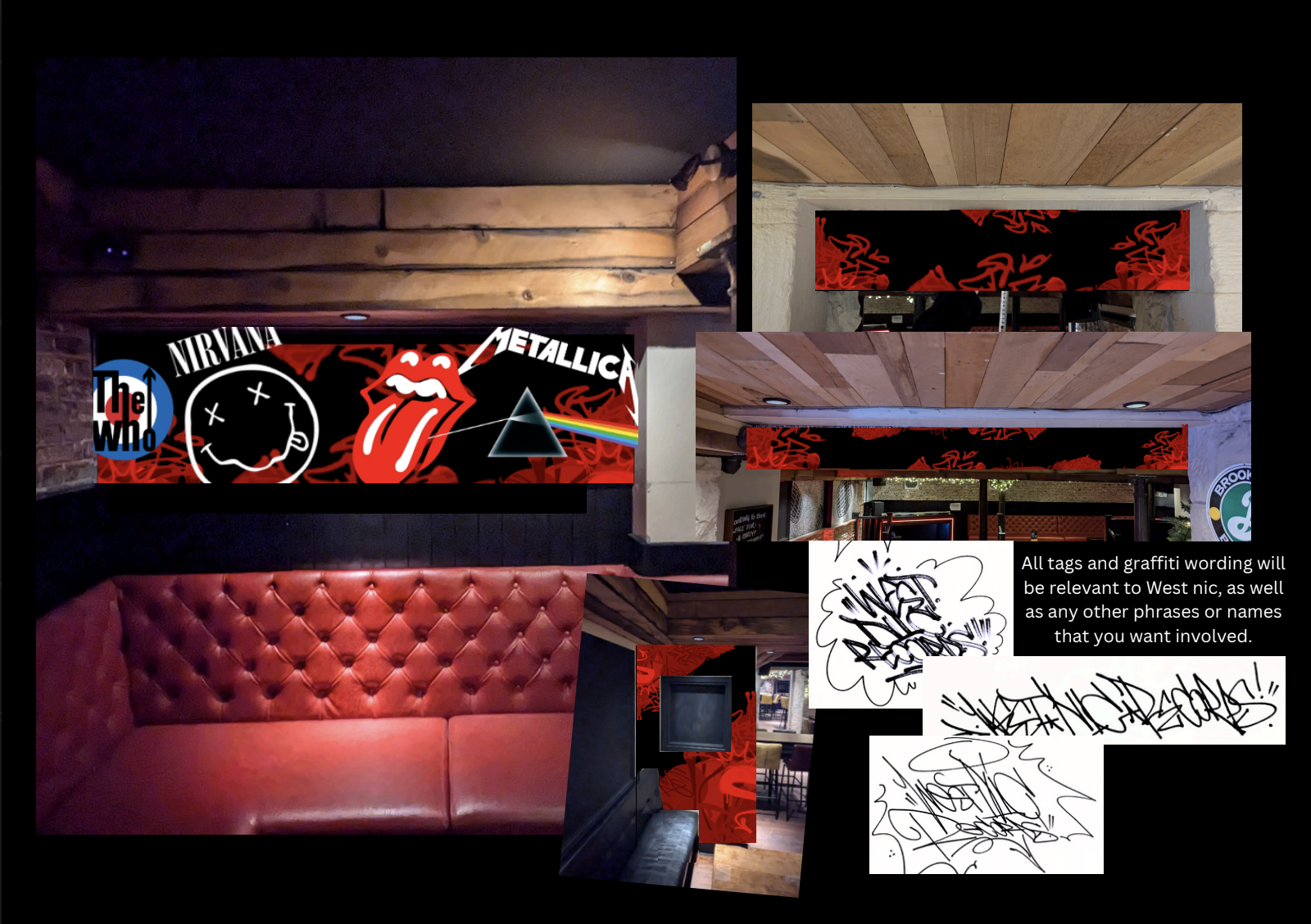

Developed mural mockups:
I helped push the mural team to these designs, that I felt fit the space better.
They felt more like pieces of art as opposed to generic decoration. There is minimal pops of colour to make them more eye-catching, but simultaneously they blend in to the walls and decor in a pleasing way.
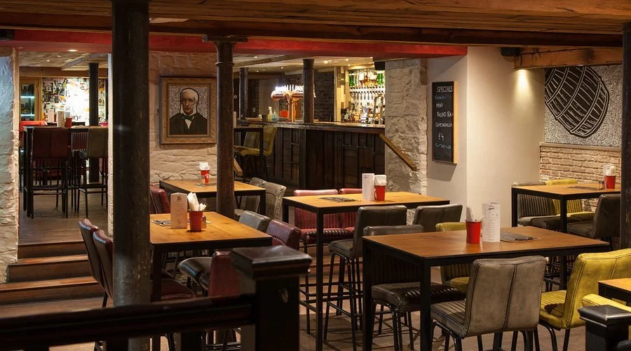
THE BAR BEFORE…
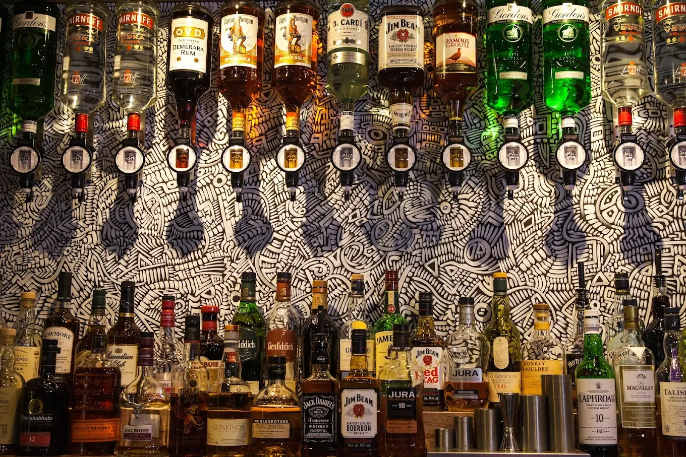

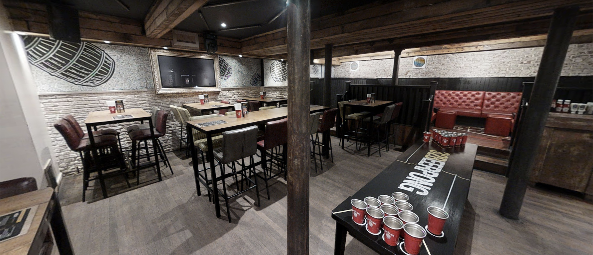


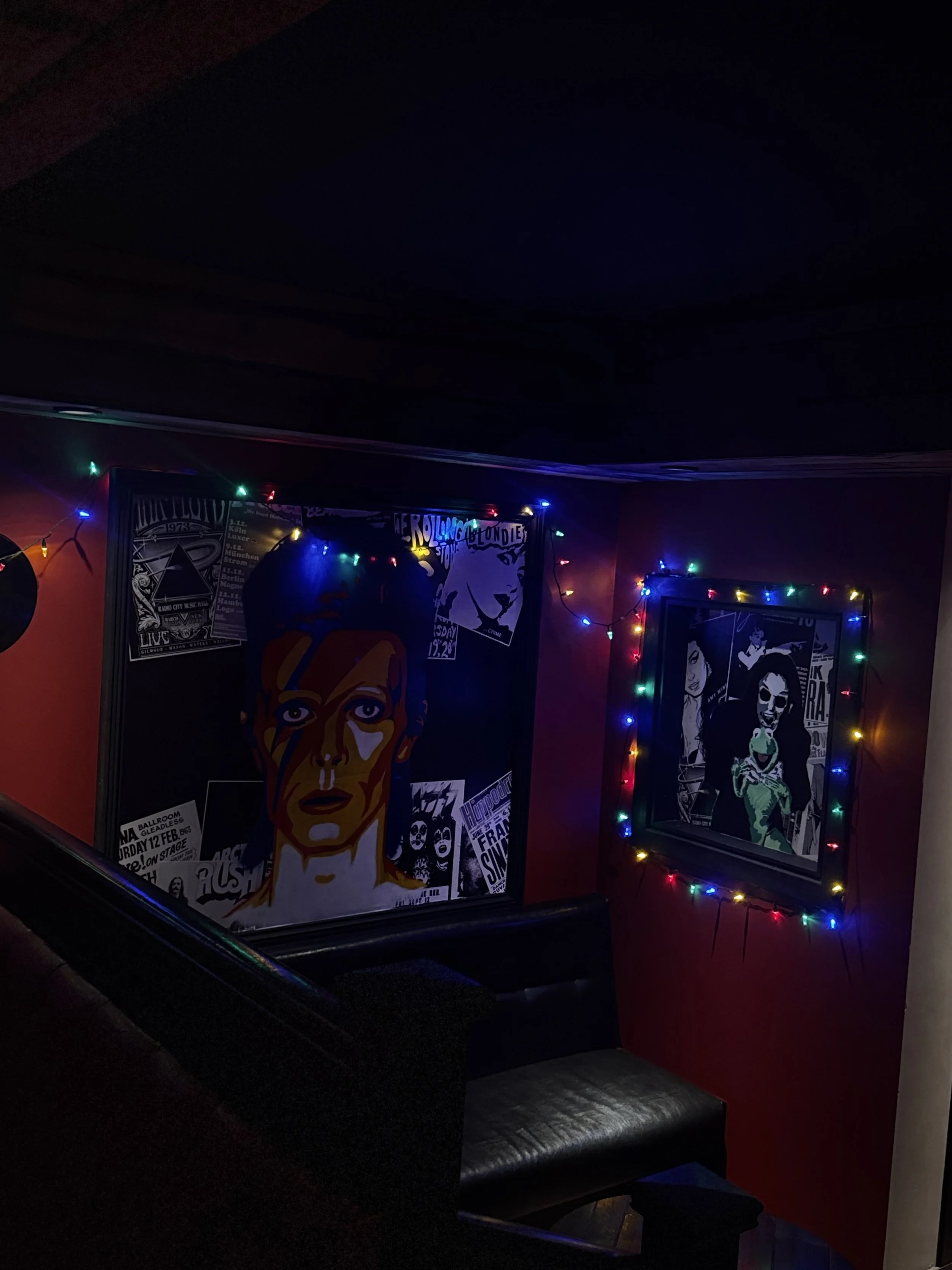
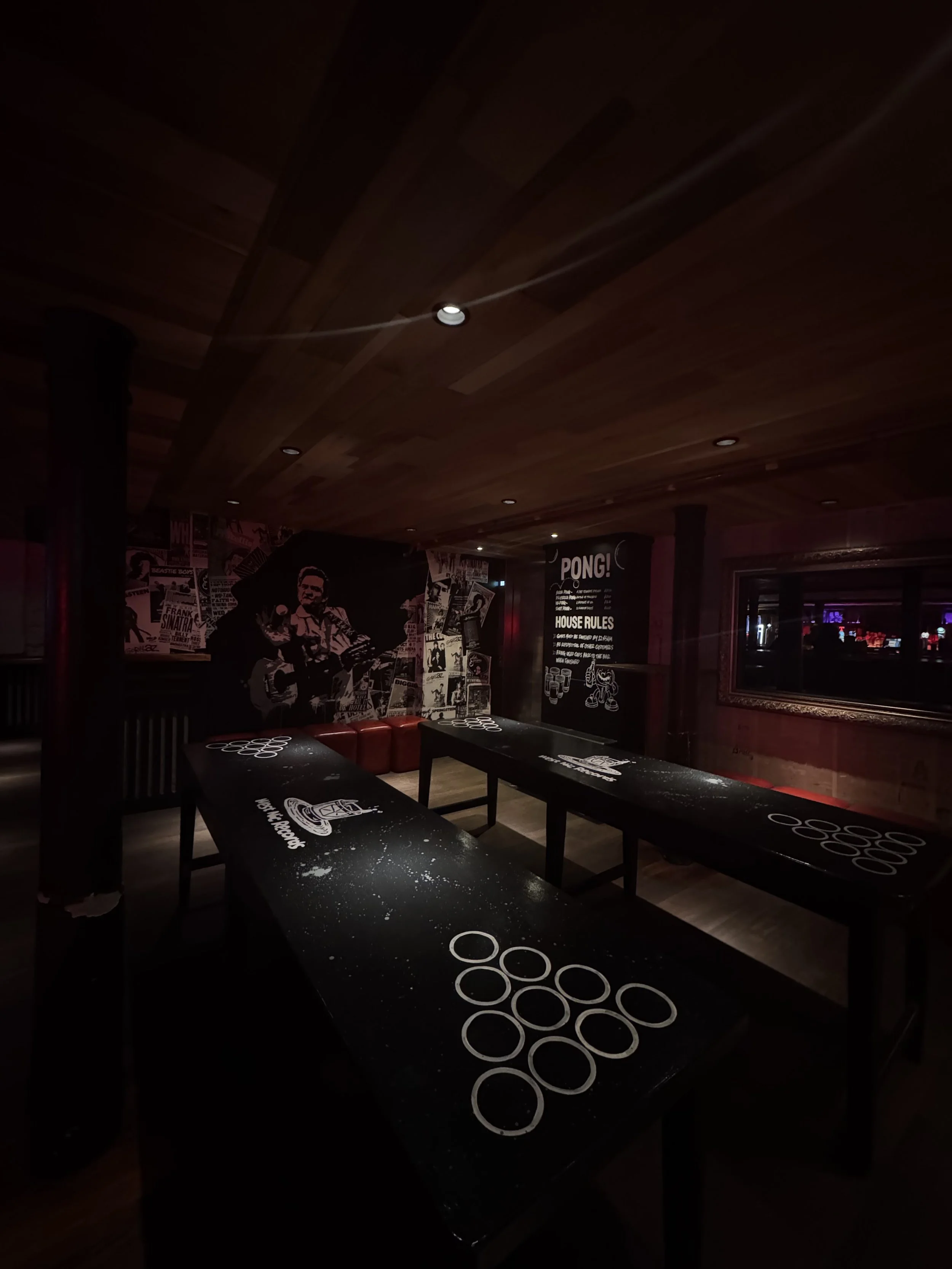
THE BAR AFTER.